Cathay Pacific - Responsive Website Prototype
Challenge
Demonstrate how Cathay Pacific can change from being an airline to a travel retailer in digital…
…in SIX WEEKS.
Cathay Pacific came to my agency knowing that they needed to revamp all of their digital properties which were out of date and did not provide the kind of experience their customers would expect. In order to secure the funding for a proper redesign, they needed a business case and something extra - something that could prove what the new digital experience could be and how it would deliver on the business case.
I led a small team of UX designers, UI designers and Developers to build a fully responsive solution in six weeks.
The approach - designing in the browser
To achieve what we needed to in six weeks, we couldn’t work in a typical “hand-off” fashion. Instead, we created an approach we called “design in the browser”. Development would start as soon as a journey was agreed between UX, UI and development. Screens would be gradually refined leading to the delivery of a complete user journey every week.
Understand the brand and define the experience principles
Prior to going into development, the UX and UI teams needed to define the brand values and how those would extend to the experience design.
As Cathay Pacific’s brand hadn’t been updated in some time, we began work to modernise elements of the brand by better understanding its positioning and values and moving it forward with refreshed colour palettes, fonts and experience principles. These were determined in a workshop with their head of digital retail and VP of Marketing.
Understanding the customers and their stories
Using existing research as well as some quick guerrilla research, we quickly defined primary and secondary personas. For each persona, we created a story that described how they might use the new Cathay Pacific experience. Each story was linked to a different aspect of the business case so we could illustrate exactly how the new experience would fulfil against business needs.
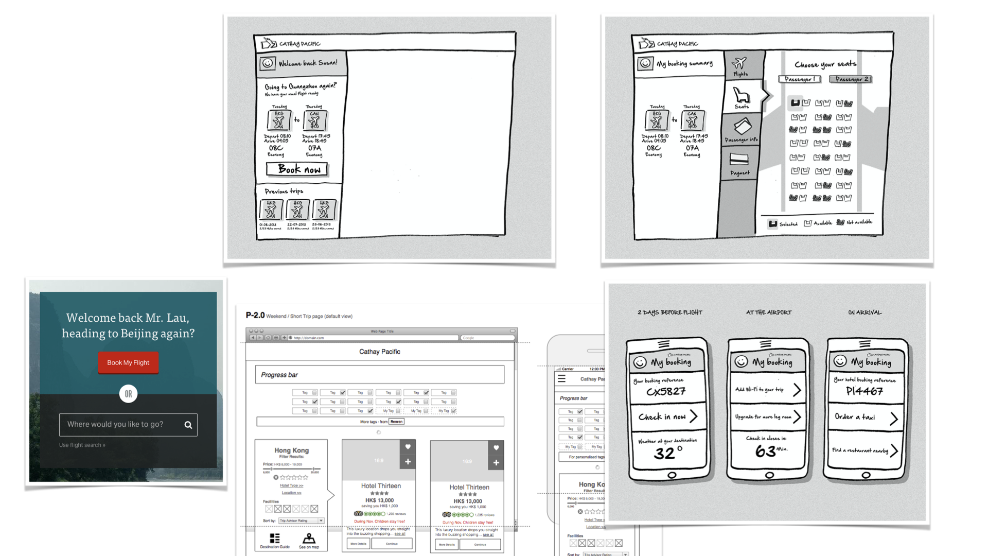
Everything starts with a sketch
At the beginning of each week, the team would sketch out one journey together. From there, the developers would start building the necessary framework, while UI design would begin with basic elements.
UX designers would investigate complex interactions in more detail and would work with UI designers and developers to update the prototype as the week progressed.
Delivering one journey per week
Each week, a new journey would be delivered. The London design team would review the journeys three times per week with the clients based in Hong Kong. As each journey progressed, the business case was also updated to reflect the level of confidence in being able to achieve against the metrics proposed.
Fully responsive solution
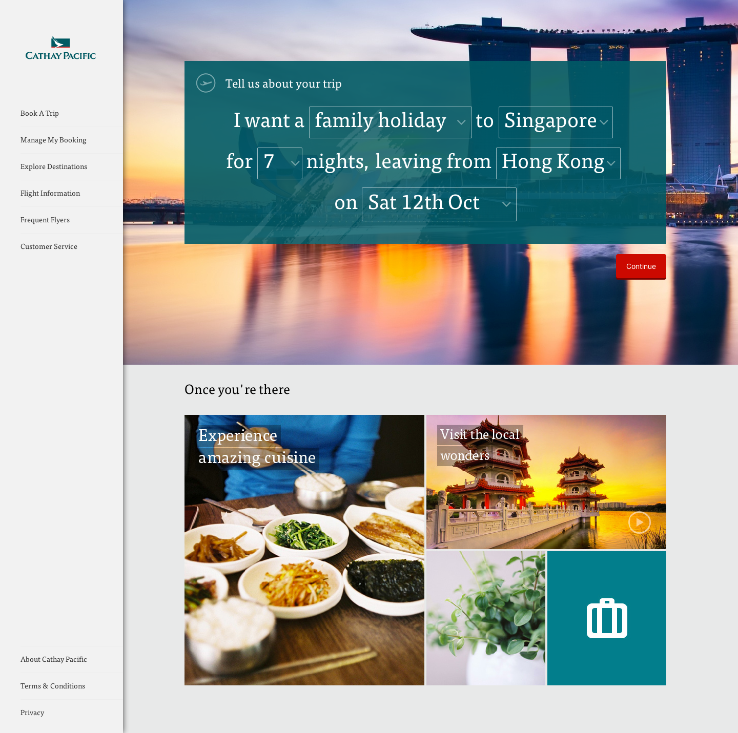
The final journeys were all completed as a single fully responsive prototype. The prototype was demonstrated for a collection of Cathay Pacific staff in Hong Kong using a local server, so staff could view and experience the prototype on their own devices.
The final proof - customer validation
The final prototype was also tested in both English and Cantonese with a collection of Cathay Pacific customers taken from a user panel. The response was overwhelmingly positive.
The success of the prototype led to Cathay Pacific awarding their project to my agency and we continued on work to redesign their global website, design and build their mobile app product and perform a full redesign of their flight booking engine.
“The first time I’ve seen a Cathay Pacific site to be proud of.”
— Cathay Pacific General Manager, Sales and Distribution


